1) Mario Testino
Nationality: British
Date of Birth: October 30, 1954
Type of Photographer: Peruvian fashion photographer
Influences: Mario Testino in his early years wanted to become a priest but he was always interested in photography. In 1976 he went to London which influenced him to study photography.

Keira Knightley for Coco Mademoiselle perfume
2) Steven Meisel
Nationality: American
Date of Birth: 1954
Type of Photographer: Fashion Photographer
Influences: He was always fascinated in beauty and models since a young age. His mother and his sister were his icons. After studying at the high school of art and design, he had an interview with Ingrid Sischy for vogue France, which influenced him to finally major in fashion illustration. 
Lydia Hearst
3) Annie Liebovitz
Nationality: American
Date of Birth: October 2, 1949
Type of Photographer: American Portrait Photographer
Influences: Because she and her family moved frequently with her father’s duty assignments, she took pictures of all her travels which influenced her to become a photographer.

Queen Elizabeth
4) Terry Richardson
Nationality: American
Date of Birth: August 14, 1965
Type of Photographer: American fashion and portrait photographer
Influences: Influenced by his father, Bob Richardson who once was a fashion photographer.

Miley Cyrus
5) David Bailey
Nationality: British
Date of Birth: January 2, 1938
Type of Photographer: Fashion and portrait photographer
Influences: David Bailey developed a love of natrual history which then led and influenced him into photography.

Leslie Caron
From all the photographs above, I have picked one that interests me the most. This is
Keira Knightley posing for a Coco Mademoiselle Chanel campaign, photographed by Mario Testino.

Mario Testino: Keira Knightley and the Coco Mademoiselle Chanel campaign
Purpose: This type of photography would be used in magazines, especially Vogue to advertise the new perfume. It would also be used online for the Vogue website as well as on television for advertisements. The Image is used to advertise the new Coco Chanel perfume, and we know this because the main focus of the image is of Keira Knightley who is a well known celebrity/model holding the new perfume.
Image Analysis:
Composition: The composition of this photo uses the Rule of thirds. Keira Knightley, who is holding the perfume is the main focus of the image and she is placed in the middle, slightly towards the right hand side. She is not fully on the right hand side, because other wise this would leave to much blank space on the Left hand side. The image is along the points where the lines intersect on the rule of thirds, which adds balance and interest to the photo.
Lighting: The lighting in this photo is relatively low key, it is uneven with a ratio of intensity of illuminated objects to create strong contrasting shadows, which is giving it a serious atmosphere. It has a fairly soft quality, and a plain color mostly in the background of the picture. But the light that is focusing on Keira Knightley and the perfume is very different to the background. This is because it is more high key, giving it a realistic look and helps the viewer to focus on what is important in the image straight away which will help it advertise more easily. The light that is focused on Keira Knightley as a harder quality than the background light to emphasizes the new perfume being advertised. There is also a contrast between the light in the background and the light focusing on Keira Knightley, helping her to stand out a lot more.
Framing: The flower background which goes all around Keira Knightley is the frame of this photo. The flowers help to isolate Keira Knightley and the perfume she is holding, so there is a more focused image of her and draws the focus the the main point of interest to help advertise the perfume.
Cropping: This photo has definitely been cropped so that the main subject is easily focused on by the viewer. The edges have slightly been cropped around Keira Knightley to eliminate the background “noise” ensuring the perfume catches the viewers attention straight away.
Fitness for purpose: This photo achieves the original aim and is appropriate for its original intention which is to advertise the new Coco Chanel perfume. This is because the Composition, lighting, framing and cropping all work together to form the correct outcome which is to isolate Keira Knightley and the perfume so that all the focus and attention is on the main subject.
Anchorage was not needed in this photo because the focus of this image is easily achieved due to Keira Knightley and the perfume standing out, by the way the photo was taken and edited. When you look at the photo, you are able to automatically figure out what the aim of this photo is, which is to advertise the new perfume because as soon as you look at it, your attention is drawn onto Keira Knightley and the perfume straight away.
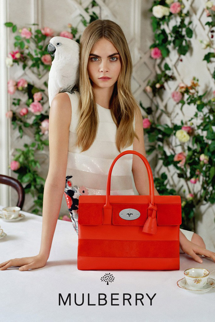
Tim Walker Photography - Mulberry Summer Collection, Cara Delevingne

Tim Walker Photography - Mulberry Summer Collection, Cara Delevingne
Tim walker:
Nationality: British
Date of Birth: 1970
Type of photographer: A Fashion Photographer
Influences: He started to become interested in photography at the condé Nast Library in London where he worked on the Cecil Beaton archive for a year before university which influenced him to become a fashion photographer.
This photo is of a well known model, Cara Delevingne advertising the collection of Mulberry bags, photographed by Tim Walker.
Image Analysis
Rule of Thirds: This photo is slightly breaking the rule of thirds, because Cara Delevingne has been placed in the middle of the vertical lines. This helps to emphasize the main focus of the photo, which is Cara Delevingne and the Mulberry bag that she is advertising. By placing them in the middle of the photo, this catches the viewers eye straight away, because you are naturally drawn to the centre of the photo where the most is happening, which is why it will help to advertise because you see the bag straight away.
Balancing Elements: As Cara Delevingne and the bag she is advertising is in the centre of the photo, which is the main focus, the photo had to be balanced because otherwise the outside of the photo would be empty and dull. To balance out this photo Tim Walker has used tea cups at the bottom of the photo, to add more interest, and around Cara Delevingne there are blurred images of different color flowers. These are very effective because they balance out the photo well, but because they are blurred the main focus is still on Cara Delevingne and the Mulberry bag as they are still both clear, even though the background is slightly blurred. This is why the blurred flowers work, as even though you cannot see them well, it is still adding color and interest to the photo but the main focus is still on what is being advertised, and you are able to see the Mulberry bag more clearly.
Leading Lines: The leading lines for this photo, start at the bottom, where the Mulberry bag is, and leads you onto Cara Delevingne and finishes at the top of her head. The leading line is straight which is effective because if there were lots of changes in direction your eyes may wonder of the main focus of the photo. This leading line helps to emphasize the main focus of the photo, because your eyes, straight away are focused on the Mulberry bag.
Symmetry and Patterns: This photo is slightly symmetrical as it has similar patterns on either side of Cara Delevingne, for example the blurred flowers either side of her are very similar, and have the same patterns but also Cara’s hair is exactly the same either side and so are her facial features. The photo has some symmetrical features, but some things are not symmetrical, for example the parrot on Cara’s right shoulder, this introduces slight tension and a focal point to the scene, and it makes the photo more exciting and less dull.
Viewpoint: This photo was shot at eye level, and the distance from the camera to Cara Delevingne is relatively close. This is effective because it makes you feel like you are involved more in the photo and feel like you are there, almost able to touch the Mulberry bag which helps advertise it even more as you can see the bag in much more clearer detail then you would from possibly higher above.
Background: The background of this photo works perfectly, as it creates a a floral, summery atmosphere which suits the main focus, because the photo is advertising the new Mulberry 2014 Summer collection. The background of this photo consists of blurred colorful flowers which lead all around Cara Delevingne. This is effective because they give they make the photo more interesting and exciting but at the same time, because they are blurred Cara Delevingne and the Mulberry bag are still the main focus of the photo as they are completely clear. There are also Tea cups in the background, which help to underline that Mulberry is a British brand.
Depth: This photo has not got a wide use of depth, as the main focus needs to be on Cara and the bag which is being advertised and if there was a wide use of depth, the focus could be elsewhere which would defeat the objective here. The only slight depth which is used, is the flowers in the background which are high up, but also close to the ground which gives the photo more flavor and makes it more interesting.
Framing: The framing of this photo are the blurred flowers which lead all around Cara’s body. This is effective because they help to isolate Cara and the bag which is the main focus from the outside world. This helps to focus more on what is being advertised, and draws your eye naturally to the main point of interest which is the Mulberry bag. Even though the flowers are all very colorful, they are still blurred so it adds flavor to the photo but does not distract you from the bag as the flowers are blurred and not completely clear like Cara and the bag are.
Cropping: This photo has definitely been slightly cropped so that it keeps the main focus of the photo and also helps the main subject to not become lost among the clutter of its surroundings. This has been slightly cropped to eliminate the background “noise” but not so much, that there is no background, only slightly to keep the focus on what is being advertised. This helps by ensuring that the Mulberry bag is still getting the viewers undivided attention.
Experimentation: I think that this photo has definitely been experimented with. I think that Tim Walker experimented with having the flowers in the background, and that, at first the flowers were not blurred which made the viewer unable to completely focus on what was being advertised. So the flowers were made to be blurred so that they were still visible, but made sure that Cara and the bag were still the main focus of the photo.
Lighting: The lighting for this photo is relatively high key, it is evenly lit giving it a realistic look. It creates a fairly upbeat mood to highlight the fact that this is the new summer Mulberry collection. The lighting has a fairly soft quality, where the light wraps softly around Cara Delevingne and the bag.
The main colours of the photo are light, except for the flowers in the background. This helps to focus on the Mulberry bag, as it is bright red which contrasts with the lighter colours in the picture helping to focus on the main subject of the photo and helps to advertise the bag.
This photo includes anchorage, because the name of “Mulberry” is secured to the product to make sure the viewer knows that the bag is from the Mulberry collection.
Fitness for Purpose: This photo achieves the original aim and is appropriate for its original intention, because all the features in this photo work together and help the viewer to fully focus on the main subject which is to advertise the new Mulberry bag.
This image advertises the product extremely well, because the photo is not jam packed with background "noise" so the bag is the viewers main focus point. The parrot also adds a slightly humorous connotation to the composition to which will catch the audiences attention which will help advertise the mulberry bag.

No comments:
Post a Comment